Landscaping Website Design That Makes Every Project Look Worth the Investment
Landscaping website design is where first impressions are won or lost. A homeowner considering a five-figure outdoor renovation or a property manager evaluating maintenance contractors will judge your operation by your website within seconds. If the design looks dated, cluttered, or generic, no amount of great landscaping work behind the scenes can overcome that initial reaction. The visual presentation of your website has to match the quality of the landscapes you build.
This page focuses on the specific design decisions that matter most for landscaping companies — visual hierarchy that leads visitors to action, portfolio presentation that sells without words, mobile UX for homeowners browsing from their backyard, trust signals that reduce hesitation, and service navigation that keeps complex offerings organized. The broader website strategy lives at /landscaping-website/ and the search optimization layer at /landscaping-seo/ — this page covers how the site should look and feel.
Visual Hierarchy That Guides Visitors From Curiosity to Quote Request
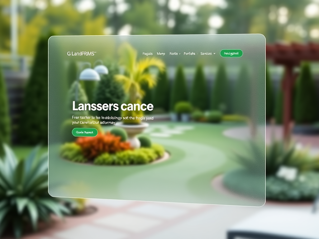
The strongest landscaping website design follows a clear visual hierarchy: a compelling hero section with your best project photo and a direct call to action, followed by service categories that let visitors self-select, then portfolio proof that builds confidence, and finally a prominent quote request form that captures the lead. Every section below the hero should reinforce the decision to keep scrolling.
Too many landscaping websites bury the call to action below paragraphs of company history or mission statements. The homeowner looking for a patio estimate does not care about your founding story on the first visit. They care about whether you do the work they need, whether your finished projects look professional, and how to get in touch. The hero section should answer all three questions within the first viewport.
LuperIQ's Theme Studio lets you control hero layout, section ordering, and call-to-action placement without writing code. You can test different hero images, headline angles, and CTA positions to see what converts better — which matters because the right hero image can double the quote request rate compared to a generic stock photo.
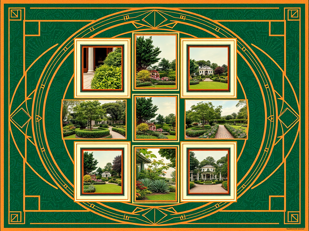
Portfolio Presentation That Sells Landscaping Work Without a Single Word
The portfolio gallery is the most important design element on any landscaping website. It needs to accomplish three things simultaneously: show the range of work you do, demonstrate quality at a glance, and make it easy to find projects similar to what the visitor wants. A masonry grid or curated slideshow of your best work creates immediate visual impact that no paragraph of marketing copy can match.
The design decisions that matter for portfolio presentation include:
- Full-width or near-full-width image display so project details are visible without clicking
- Category filtering so visitors can view only patios, only lawn installations, only drainage work, or only commercial projects
- Before-and-after comparison layouts that show transformation — ideally with a slider or side-by-side presentation
- Consistent image aspect ratios and lighting quality across the gallery to maintain a polished feel
- Project descriptions below each photo set with service type, location, and scope of work
- Lazy loading so the gallery page loads fast even with fifty high-resolution images
The LuperIQ media manager supports WebP conversion for fast loading, category tagging for filtered galleries, and caption fields for each image. Your landscaping website design should make the portfolio the centerpiece, not an afterthought buried in a sidebar.
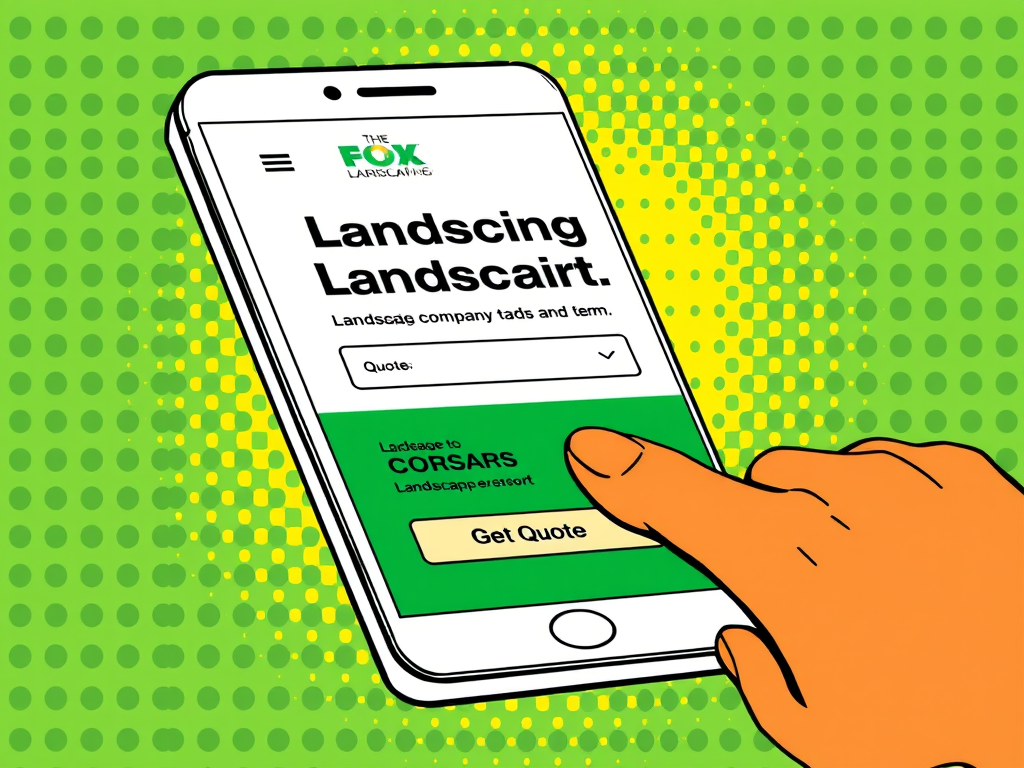
Mobile UX for Homeowners Browsing Landscaping Websites From the Yard
More than sixty percent of landscaping website traffic comes from mobile devices. The typical scenario is a homeowner standing in their yard, looking at a problem they want solved — a bare flower bed, a crumbling retaining wall, a drainage channel that floods after every storm — and searching for a landscaping company on their phone. Your landscaping website design has to work flawlessly in that context.
Mobile UX for landscaping websites means tap-friendly navigation with large menu targets, portfolio images that fill the mobile screen width, quote request forms that are short enough to complete with a thumb, and a click-to-call phone number visible on every page. It also means fast loading — a gallery page that takes six seconds to load on cellular data loses the visitor before the first image appears.
The LuperIQ platform renders every page responsively by default, with automatic image sizing per viewport and touch-optimized interactive elements. Theme Studio's responsive configuration lets you preview and adjust the mobile layout separately from desktop, so your portfolio grid can display as two columns on desktop and a single scrollable column on phone without compromising either experience.
Trust Signals That Reduce Hesitation on a Landscaping Website
Landscaping is a high-trust purchase. Customers are inviting your crew onto their property, trusting your judgment about plant selection and drainage, and often paying thousands of dollars before they see the finished result. Your landscaping website design needs to include trust signals that reduce that natural hesitation.
The trust signals that move the needle for landscaping companies are not abstract badges or generic icons. They are specific and verifiable:
- Google review count and rating displayed prominently — ideally with a link to the actual reviews
- Customer testimonials with first names, cities, and project types so they feel real
- License and insurance information visible in the footer or about section
- Years in business and crew size to communicate stability and capacity
- Specific service-area cities listed so visitors know you operate locally
- Association memberships or certifications relevant to landscaping professionals
- Before-and-after portfolio entries that demonstrate consistent quality over time
Position these trust signals where they intersect with decision points — near the quote request form, alongside the portfolio, and in the footer that appears on every page. The platform supports structured testimonial blocks, review integration, and customizable footer content.
Service Navigation That Keeps Complex Landscaping Offerings Organized
A landscaping company offering maintenance, design-build, hardscaping, irrigation, drainage, tree care, and commercial services has a navigation challenge that most website builders handle poorly. Dumping everything into a single Services dropdown creates a wall of links that overwhelms visitors. Spreading services across the main navigation bar wastes horizontal space and pushes more important elements off screen.
The cleaner approach is a structured mega navigation or organized service hub page that groups related services logically. Maintenance services (mowing, edging, bed care, seasonal color) form one group. Construction services (patios, retaining walls, outdoor kitchens, fire pits) form another. Specialty services (irrigation, drainage, tree work) get their own section. Each group links to dedicated service pages with full descriptions, portfolio photos, and pricing guidance.
LuperIQ's mega navigation system supports grouped service links with descriptions, keeping complex menus organized without sacrificing usability. The goal is for every visitor to reach the relevant service page within one click from any page on the site. For details on the overall page structure, see /landscaping-website/ which covers the complete service architecture.
Color, Typography, and Brand Identity in Landscaping Website Design
The color palette and typography of a landscaping website communicate positioning before a single word is read. Earth tones — deep greens, warm browns, natural stone grays — signal outdoor professionalism and connect to the industry visually. Bright whites with green accents create a clean, modern feel that appeals to suburban residential clients. Dark backgrounds with high-contrast text create a premium, design-focused aesthetic that works well for high-end landscape architecture firms.
Typography choices matter equally. A landscaping company targeting residential maintenance customers benefits from clean, readable sans-serif fonts that feel approachable. A design-build firm targeting luxury renovations might use a refined serif for headings paired with a clean body font to communicate sophistication. The key is consistency — every page, every heading, every button should feel like part of the same brand.
Theme Studio provides full control over color variables, font pairings, and spacing across the entire site. You can test different palettes without rebuilding the site, and the responsive system ensures your typography scales correctly from desktop monitors down to phone screens.
Frequently Asked Questions About Landscaping Website Design
What is the most important design element on a landscaping website?
Should a landscaping website use stock photos?
How important is website speed for landscaping companies?
What colors work best for landscaping website design?
How should a landscaping website handle the quote request form?
Do landscaping websites need separate pages for every service?
How often should a landscaping website design be updated?
Landscaping website design is not decoration — it is the mechanism that converts search traffic into quote requests and project consultations. Every design decision, from hero layout to portfolio presentation to mobile form usability, either moves visitors toward action or pushes them back to the search results. Build on the complete strategy at /landscaping-website/, strengthen your visibility with /landscaping-seo/, and connect it all with /landscaping-marketing/ to create a website that works as a complete growth system.